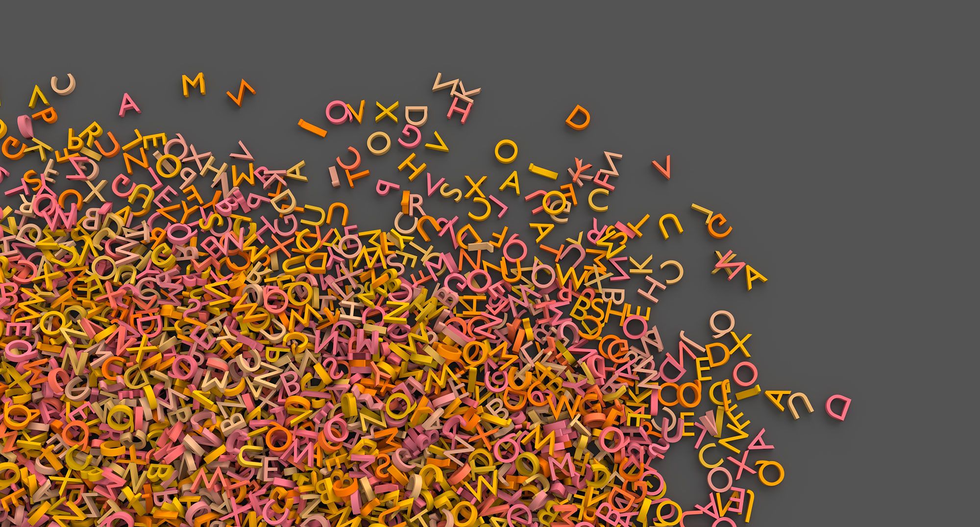
High quality fonts can improve a websites readability and aesthetics. They can also define the tone of your website and your brand. Using the right combination of type face, sizing, weight and spacing can instil elegance, experience, professional or strength. Getting this combination right is an art that a good designer should be able to employ.
Here are some of the key points to focus on when pairing fonts on your website.
Readability
Of utmost importance is the ability to easily read text on your website. Not every font is designed for readability. A font may have been designed to be more artistic and perhaps used at much larger font sizes than you would typically use on a website. A standard at the moment is to use a font size of 16 pixels in height for the body of your website content.
Not all fonts work well on web. On a website, font sizes for copy within a page might range from as little as 12 pixels high to 24. Not all fonts display well at those sizes. Not only that, depending on the viewers operating system and browser there could be some variances in the way the displaying device renders the font. Designers may think their fancy new font looks great on their 27 inch iMac, but it could be a completely different story on an older PC.
In my experience, the quirkier and free fonts (apart from Google fonts) are less likely to translate well on all devices. There’s a reason why some really professional fonts cost quite a bit of money. They are designed to perfection.
Characteristics
Fonts can be fun, professional, vintage, modern, ultra modern, classic. There are a range of styles that can convey an emotion on your website. Make sure you choose something that is appropriate for your brand.
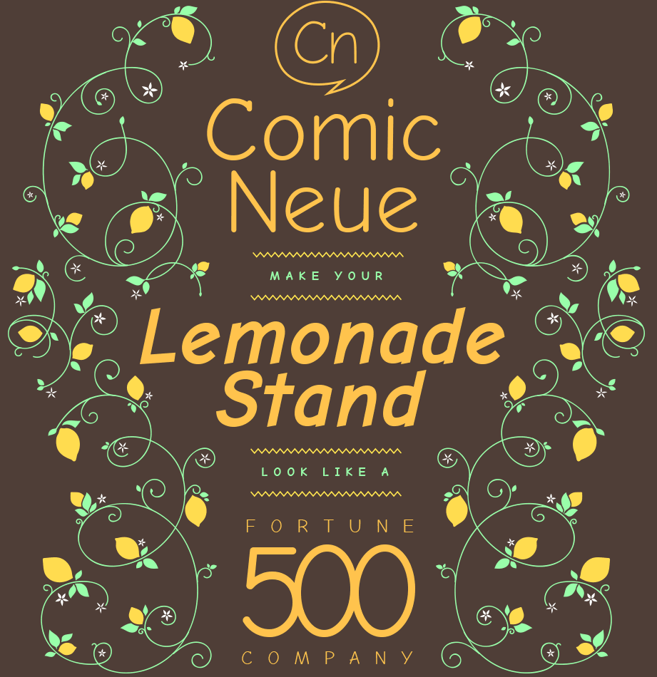
An old running joke is that non-designers would seem to love using the font comic sans (the cartoon/comic book style font). To the uninitiated it may have seemed like a fun font to use, and who doesn’t love fun? But professionally, use of the font is deplored as juvenile and unprofessional. It even spawned many hate websites like Comic Sans Criminal.
If you just can’t resist the thought of this fun font, maybe considered Comic Neue. It’s ‘kind of’ cool.
Think about how you want people to feel about your brand and choose wisely. If in doubt, consult a professional.
Variation
Using different fonts to seperate components of your website can be a great tactic. The fonts used on your headings could be completely different to the font of your body copy. You might use a more artistic font for a large title on each page. This variation can make your page easier to read because it’s very easy to pick up where things are seperated.
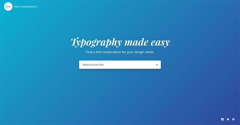
But not all fonts go well together. The variation must contrast but at the same time complement. Ultra modern font for the body, with a vintage old english font for titles would be a nasty clash. You could spend a lot of time with trial an error, or you could check out some inspiration websites such as Font Pair and Canva’s font combination page.
Weights
Another great way to create variation, increase readability and even add a bit of character is to alter the weight. That might be bold, extra bold or black (the boldest), but could also mean the other direction, light or ultra light.
Ultra light titles can appear very refined and sophisticated, but be warned you will need to increase the font size so they remain readable. Too small and they become too thin and lose their shape.
Big bold titles clearly define content blocks, don’t need to be as large in height and are more typical for a title. Just don’t overdo it. If there are a lot of large dominating titles on a page it might become confusing as to where to look.
Performance
If you use a lot of different fonts or even just a lot of weights on your website, you can start to bog down your website load time. Generally the more artistic the font the larger they are. If you can stick to a simple selection of fonts and font weights such as regular and bold, or regular and light you can minimise the additional file size.
One of best free font resources available is Google Fonts who offer a speed indicator when you are selecting your font pack. For anything that is more than 250kb to download I’d have to really want that font design wise and that’s the point where it becomes a bit of a performance hit.
Choose fonts for your website wisely
Of course you don’t have to use a custom font for your website. Web safe system fonts will display your content ably and clearly. But I can tell you I haven’t created a website using a web safe font for many years. Choosing a custom font that conveys a brands personality is a really strong design tactic and has a massive impact. So with these points in mind, take care when selecting fonts to use on your website and ensure it complements your business traits, is easy to read and is fast to download.