
On a website, every element plays a crucial role in shaping the user experience. One often-underestimated but essential element is “white space.” It’s not just the blank canvas; it’s a powerful tool that impacts readability, user engagement, and overall aesthetics. In this blog, we will delve into the significance of white space in web design, exploring how its strategic use can enhance the visual appeal, clarity, and effectiveness of your website. Whether you’re a seasoned designer or just starting, understanding the role of white space is key to creating a captivating and user-friendly online presence.
The Aesthetics of White Space
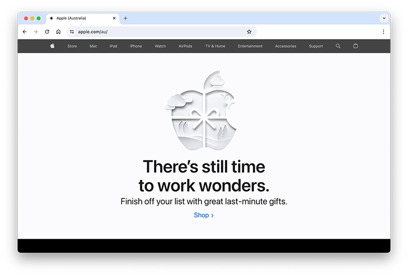
White space, often referred to as negative space, is the art of purposefully leaving areas on a web page free from content or visuals. This deliberate emptiness serves to balance the elements on the page, allowing the important components to shine. In terms of visual appeal, white space creates a sense of elegance, simplicity, and sophistication. It helps users focus on the essential content and prevents visual clutter that can overwhelm visitors. By providing breathing room around text, images, and other elements, white space contributes to a clean and visually pleasing design, making your website more inviting and engaging for users.
Impact of cluttered vs. spacious website designs
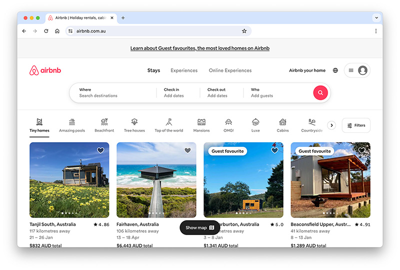
The impact of cluttered vs. spacious designs on web design is significant. Cluttered designs, characterised by excessive content, can overwhelm users, making it challenging to find essential information and navigate the site. This can lead to a poor user experience, increased bounce rates, and decreased conversions. In contrast, spacious designs, incorporating ample white space, provide a visually harmonious and user-friendly experience. They enhance readability, guide users’ focus, and convey a sense of professionalism. Spacious designs foster better user engagement, encouraging visitors to explore the content and interact with your website, ultimately leading to improved retention and conversion rates.
Usability and Readability
White space plays a crucial role in enhancing readability and user engagement on a website. Ample white space around text and elements allows for better content separation, making it easier for users to scan and absorb information. This improved readability reduces cognitive load and frustration, leading to a more positive user experience.
Striking the right balance ensures that content is easily digestible, maintaining user interest and engagement. Careful consideration of typography, font size, and spacing is necessary to achieve this equilibrium, creating a visually appealing and user-friendly web design that effectively communicates your message without overwhelming or underwhelming your audience.
Additionally, white space provides a sense of organisation and clarity, guiding users through the content and encouraging them to explore further. In turn, this leads to increased user engagement, longer time spent on the website, and a higher likelihood of achieving your website’s goals, whether that’s conversions, subscriptions, or other actions.
Tips for optimising white space for usability
Optimising white space in web design is essential for improving usability and enhancing the overall user experience. Here are some valuable tips to achieve this:
- Use white space to emphasise key elements and make them stand out.
- Ensure consistent spacing throughout your website for a polished look.
- Divide content into manageable sections with appropriate spacing for clarity.
- Keep text lines at an optimal length for easier reading.
- Apply generous padding and margins around elements to prevent crowding.
- Ensure that your white space adjusts effectively on different devices and screen sizes.
- Gather feedback from users to fine-tune the white space for improved usability.
Branding and Identity
In web design, an effective use of white space can convey professionalism, sophistication, and attention to detail. A clean and spacious layout can make a brand appear more trustworthy and authoritative to visitors. On the other hand, cluttered and chaotic designs can create a negative impression, suggesting disorganisation or lack of professionalism. Therefore, understanding how to harness white space strategically can influence how users perceive and engage with a brand.
The psychological impact extends to user emotions. White space can evoke a sense of calmness, relaxation, and focus. It provides room for users to breathe and absorb content without feeling overwhelmed. This positive emotional response can lead to better user experiences and increased brand affinity. Conversely, a lack of white space may induce feelings of frustration or confusion, which can drive users away from a website or brand. In essence, the psychological aspect of white space plays a pivotal role in shaping how users connect with and perceive a brand online.
Call to Action (CTA) Emphasis
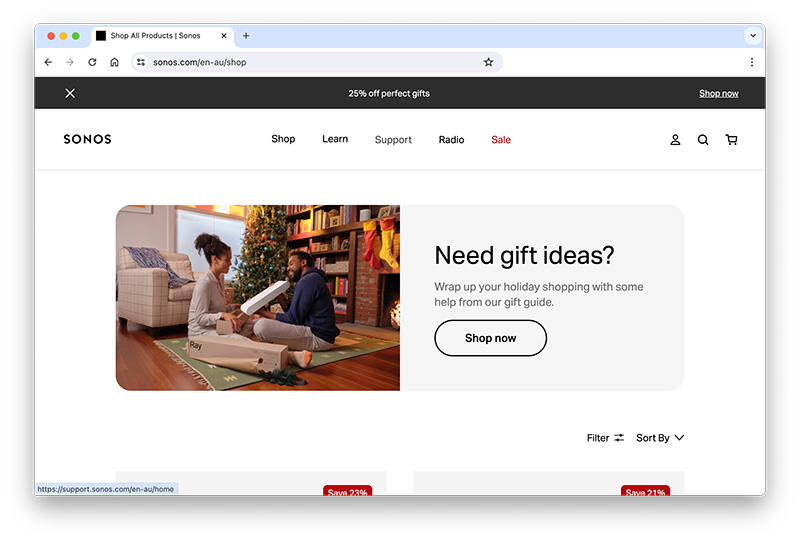
White space plays a crucial role in highlighting Calls to Action (CTAs) on a website. By strategically incorporating white space around CTAs, web designers can draw users’ attention to these key elements. The ample surrounding space makes CTAs stand out visually, making it clear where users should click or take action. This practice enhances usability and encourages desired user interactions, ultimately leading to higher conversion rates. In essence, white space acts as a visual cue that guides users towards important CTAs, improving the overall effectiveness of a website’s design and its ability to drive user engagement and conversions.
Utilising white space strategically is a key component of increasing conversion rates. Here are some effective strategies:
- Surrounding your call-to-action buttons with white space makes them more prominent and clickable.
- Organise content with enough white space between sections and headings to guide users through the page seamlessly.
- Minimise distractions by adding white space between elements, which keeps the focus on essential information and CTAs.
- Ensure white space adjustments for mobile devices, maintaining readability and engagement.
- Achieving an appealing balance between content and white space enhances user experience and trust, ultimately boosting conversion rates.
Common Mistakes to Avoid
Identifying common pitfalls in handling white space is crucial for effective web design. Overusing or misusing white space can harm the overall design by:
- Too much white space may result in a lack of essential content, leaving users uninformed.
- Poorly spaced elements can disrupt the flow and cohesion of the page, leading to a disjointed user experience.
- Mismanagement of white space can make it challenging to establish a clear content hierarchy, causing confusion.
White space is not just empty space on a web page; it’s a powerful design element that plays a significant role in creating exceptional web experiences. When used effectively, it enhances visual appeal, readability, and user engagement. Finding the right balance between text and white space is key to a successful design. Moreover, understanding the psychological impact of white space on brand perception is crucial. It highlights CTAs, improving conversion rates. However, designers must be cautious about common pitfalls and misuse of white space. Overall, mastering white space is an art that can elevate web design to the next level, offering users a visually pleasing and enjoyable experience.