What Is Accessibility?
Accessibility is making information, activities, and/or environments sensible, meaningful, and usable for as many people as possible.
A key consideration to do with accessibility and digital is how short our attention spans are.
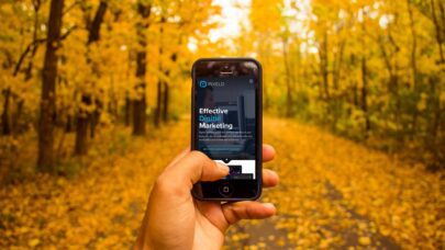
If someone is served an ad, opens an email, lands on a website or blog, and doesn’t immediately notice a great hook, USP or promotion, they won’t hang around to make sense of it. Same can be said about ensuring it is clear what action we’d like a user to take next, make that CTA stand out and ensure it’s an easy, quick process when possible.
There are three key areas to consider when it comes to accessibility and digital marketing: audio, visual and tech.
Why is accessibility important?
Allowing the message to be received as clearly as possible, regardless of ability and context, maximises reach and improves user experience online.
Whether your business has a marketing team, or currently building your brand on your own, the differences we see in website design and digital marketing quickly remind us how important accessibility and user experience is. And how this can feed into brand perception, loyalty and conversions. The bottom line is, don’t miss out on communicating with your audience when these simple oversights have easy, affordable fixes.
Audio Accessibility
This doesn’t only impact people who are deaf or hard of hearing, but also when volume isn’t as expected in content, or people who aren’t in an environment where they can play a video with sound – like those who forgot earphones for the train! Or are “watching” tv with someone…
Facebook has an old statistic from 2016 that as much as 85% of video views happen without sound, so how much of the audience never heard your great USP or promotion?
Audio accessibility can also include an imbalance between sounds/music and commentary, you’ll often experience this when you go back to the first few episodes of most successful podcasts. Startlingly loud introduction music followed by quiet commentary. Not a great experience.
How to make content aurally accessible:
- Captions or subtitles.
- Overlaid graphics.
- Accompanying transcripts.
- Clear, informative copy alongside video content.
- Volume consistency and negative space.
- Sign language if appropriate – such as Auslan interpreters in Government Press Conferences and recently at music festivals.
Accessibility doesn’t have to be laborious, free tools like Canva to add graphics, most video apps including have automated caption generation within the app (quick tip: sense check these before posting or exporting!), and Google has a free Speech to Text API. These small but impactful considerations can help boost brand loyalty and advocacy by ensuring the message is clear and received through a good experience.
Visual Accessibility
Visual considerations include colour, size, spacing and overall design/layout. Including ensuring that the content is formatted to suit both desktop and mobile.
Colourblindness impacts almost 9% of the Australian population, Trello sets a great example of a label option with “Enable colourblind friendly mode”. Colourblindness aside, high-contrast colours are encouraged across all media, if someone can’t quickly see what your text says, what would make them do the desired action? An example of this in practice is HubSpot that have a “High Contrast” toggle button across all their articles, which makes the CTAs change from orange to blue.
Within brand guidelines there are usually primary, secondary and tertiary colours included, or primary and accent colours. Out of these, two are usually very contrasting to allow ease with background/text colours and accents/highlights including CTAs.
How to make content visually accessible:
- Contrasting colours.
- Colourblindness mode.
- Consider the context/device during design.
The above can be as quick as something known as “The Squint Test” which is when you squint at your screen and see what your eyes are drawn to, and from a conversion perspective, whether your CTA button is clear enough against other elements in the page. When considering other visual accessibility, this can be done by inspecting your website, see video below.
https://www.loom.com/share/fad69a68b70c4192bb5bd36eaec720c2
Tech Accessibility
Tech considerations include speed, data and device.
Site or page speed is the leading cause of high bounce rates, and can be due to auto-play videos, and images sizes on website and can relate to user data. An example of a brand trying to fight against data inconsistency due to the large impact this has on user experience is Netflix – allowing users to download their episodes/movies while their data is good so that they aren’t irritated by buffering when they go to watch it.
Another point to consider is that most devices have introduced light and dark modes. We often see this wreak havoc in emails when a logo or creative element has a transparent background and text that is too similar to light or dark mode. The solution for this is simple, include a background behind the logo rather than a transparent background.
Google made a big update to their algorithm back in 2015, and if a page wasn’t mobile-friendly the page would be penalised organically (SEO) on mobile devices, making them less visible regardless of if websites rank highly across other SEO factors.
How to make content technologically accessible:
- Check your site speed.
- Suit both light and dark modes.
- Device optimised.
If you’d like to learn more about accessible, and impactful website designs, you can request our packages brochure which outlines inclusions for differing levels of investment, and which package might be best suited to you.