You’ve just dropped a year’s worth of marketing budget on a new website, you’ve told the world on social media and your mum even liked and shared the post. Refreshing your email inbox, there must be something wrong. No new customers. No avalanche of sales. No conversions. Something is not right, but what?
It’s not enough to build a website that looks pretty. Telling your visitors how good you are might not get the job done either. If you want results that have a meaningful impact on your business, you will probably need to put a lot more effort into your website’s design and by design, I mean the components on the page. Not the colours and pictures.
You must get inside your potential customers’ heads and address their concerns. Buyers want to feel like their decision is a smart and safe one. Luckily there are some tried and tested components you can add to your website to do just that.
Calls to action in your website design
We’ll start with the most obvious, a call to action, sometimes called a ‘CTA’. A CTA is made up of words or phrases and often a button or form. This prompts or encourages your website visitors to do something you want them to do such as making an appointment or a purchase.
Nobody likes to feel lost on a web page, so learning about your business, enquiring and purchasing should be an easy and intuitive process. Instead of waiting until they read to the bottom of a page, add various CTAs higher up the page to invite faster conversion. Your CTAs should be simple and clear with no more than one on the screen at any given time so the user isn’t confused.
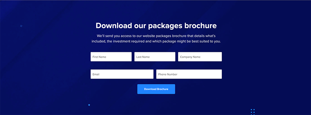
Landing pages that have paid advertisements pointing to them quite often have a lead form at the very top of the page. When you are paying for traffic it can be best to get straight to the point.
The most simple CTA might be to ask the user to submit an enquiry. You could link a button to your contact page, but if possible have the enquiry form right there on the page. If you can tailor the messaging in your CTA to be more relevant to the content they have just read, better still.
Where to place social proof
If I tell you I am the best web designer in the world, you probably would not believe me. But if 50 of my customers told you, you might start to. We’d much rather hear what other people say about a business than hear it from the business itself. Hearing it from others is more trustworthy and feels safer.
- Testimonials,
- reviews,
- star ratings, and
- customer results
These are all forms of social proof. Evidence that your product or service does what you say it does.
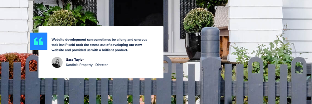
As consumers, we will happily take the feedback of random, unidentified strangers and absorb this as confirmation of our own thoughts about a business. Even knowing the social proof has been hand-picked and we have no idea how much negative feedback exists. It doesn’t matter. Your visitor wants that final nudge to convert, and social proof confirms for them that it is the right decision.
So where to place these within your page’s design? The latest advice is to place your social proof as close as possible to your call to action, even a part of it if possible. Make that final step a no-brainer for your visitors.
Awards and accreditations
![]() Some people feel uncomfortable with the humble brag. Nobody else is going to sing your praises so it’s completely acceptable to talk about how good you are, as long as you can convert that into being able to better serve your customers. The award should be for how well your served your customers. Not for banking a squillion dollars and taking off to Mikanos for the summer.
Some people feel uncomfortable with the humble brag. Nobody else is going to sing your praises so it’s completely acceptable to talk about how good you are, as long as you can convert that into being able to better serve your customers. The award should be for how well your served your customers. Not for banking a squillion dollars and taking off to Mikanos for the summer.
Publishing awards or accreditations with graphics that look like badges or wreaths give your page design a credibility booster shot.
Write compelling but obvious copy
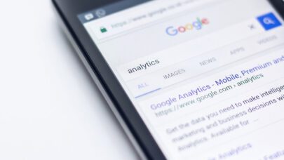
Direct and obvious headings work really well. Google can easily identify what the content is about, but so can website visitors. We like to find information as quickly as possible and skimming headings is the best way to do that.
If the heading isn’t about the service or product, then it should be about the benefit. Communicate the value of your content so that reading on seems worthwhile.
You can get a lot more creative in the body of your copy. It still needs to be clear and concise but you can work on persuasive language to convince your visitor to convert. Try not to talk too much about ‘we’ and ‘our’ and focus more on ‘you’ and ‘your’ to make your user feel more engaged.
Bullet point lists are a great way to get across features or benefits and break up the aesthetics of your page so it’s not just a big block of text.
Leveraging psychological triggers: the power of scarcity
Psychology plays a pivotal role in website conversions, particularly through the principle of scarcity. When an item or service appears scarce, it inherently becomes more desirable. This urgency can be subtly integrated into your web design to encourage quicker decision-making from your visitors.
Implementing Scarcity Tactfully
Limited Availability
Emphasize the exclusivity of your product or service by clearly indicating limited stock or availability. For example, showing real-time updates like “Only 3 items left in stock” or “2 more slots available for this price” can create a sense of urgency. This approach is particularly effective when you can genuinely showcase the dwindling availability of your offer, nudging visitors towards making a prompt decision.
Time-Sensitive Offers
Integrating a countdown timer on your website for certain deals or using phrases like “Sale ends in 4 hours” can effectively create a time-bound urgency. This method works well for promotions or special events. The key here is to ensure that these deadlines are real and not just a perpetual countdown resetting each day, which could erode trust over time.
Exclusive Deals
Offering something exclusive can make visitors feel special and more inclined to take action. This could be in the form of “Early bird access for the first 50 sign-ups” or “Exclusive package only available for a limited period.” Exclusive deals should feel genuinely special and provide tangible additional value, making the decision to act immediately more appealing for the visitor.
However, it’s crucial to use scarcity authentically. Overuse or false scarcity can backfire, causing visitors to question your credibility. Employ these tactics judiciously to create a genuine sense of urgency that motivates action without sacrificing trust.
Fast Web Page Load Speeds
Fast loading times on a website are crucial for both user experience and search engine optimisation. A website that loads quickly keeps users engaged, reducing bounce rates and encouraging them to explore more content. This speed is also a key factor in Google’s ranking algorithm, impacting your site’s visibility in search results. Ideally, a webpage should load in 2 seconds or less. Achieving this requires optimising images, minimising HTTP requests, using content delivery networks (CDNs), and ensuring efficient coding practices. Regularly monitoring and improving your website’s load time can significantly enhance visitor satisfaction and conversion rates.
Utilising live chat and chatbots
Integrating live chat or chatbots on your website can be a game-changer in terms of visitor engagement and conversion. This feature offers immediate communication, addressing user queries or concerns in real-time, which greatly enhances the user experience.
Benefits of Live Chat and Chatbots:
- Visitors can get their questions answered instantly, leading to higher satisfaction and increased trust in your brand.
- Interactive chats can keep visitors on your site longer, providing more opportunities to convert them into customers.
- Chatbots and live chat can be programmed to capture visitor information, helping in building a database for future marketing.
- Chatbots offer a cost-effective alternative to 24/7 customer support, handling routine inquiries without human intervention.
- They can provide personalised recommendations based on user interactions, enhancing the overall experience and guiding visitors towards conversion.
Incorporating these tools requires thoughtful implementation to ensure they align with your site’s user experience and are programmed to effectively address common visitor inquiries.
Guide the user to the end goal
At the end of the day, you are putting forward your best case to your customer as to why purchasing with you is a smart decision. Don’t just tell your visitors, show them. Make your product so compelling that it would be stupid of them not to purchase it.
These tactics are just some of the ways to attract more conversions but there are loads of other methods. Colour psychology, video content and high-value content offers just to name a few. Talk to us if you’d like to boost your website’s conversion rate.